Style
Instances of Desktop, Widget, and Container classes are semantic elements of the GUI, describing the structure and meaning of the content.
The Style API (ej.mwt.style) defines style options for widgets, allowing for a clear separation of the core structure (content) and the design aspects (colors, fonts, spacing, background, etc.).
Note
Some of the attributes are inspired by CSS, like Background, Border, Color, Dimension, Font, Alignment, Margin/Padding. And the CascadingStylesheet manages the order of the selectors (with their specificity), the cascading, etc.
Selectors
Selectors determine the widget(s) to which a style applies. There are three main types of selectors:
Simple selectors (based on type or class),
State Selectors (based on state or position),
Combinators (based on relationships or conditions).
Note
More of this will be presented in the Advanced Styling step.
Usage
With a CascadingStylesheet, we can define a style for all labels using a TypeSelector:
CascadingStylesheet stylesheet = new CascadingStylesheet();
EditableStyle style = stylesheet.getSelectorStyle(new TypeSelector(Label.class));
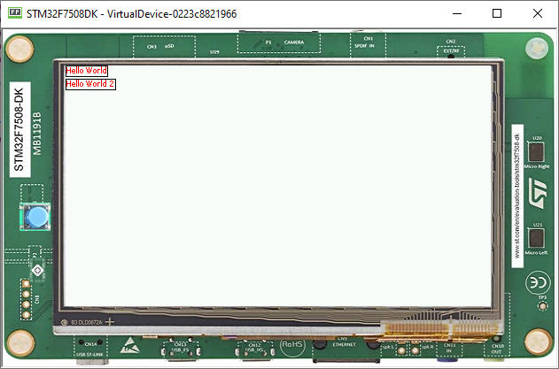
We can now change the style object options. In this sample, we change the base color to red and adding a black rectangular border of 1px thickness.
style.setColor(Colors.RED);
style.setBorder(new RectangularBorder(Colors.BLACK, 1));
For these options to take effect, bind the stylesheet to the desktop.
desktop.setStylesheet(stylesheet);
The final code looks like this:
public static void main(String[] args) {
   MicroUI.start();
   Desktop desktop = new Desktop();
   Label label = new Label("Hello World");
   Label label2 = new Label("Hello World 2");

   Canvas canvas = new Canvas();
   canvas.addChild(label, 0, 0, Widget.NO_CONSTRAINT, Widget.NO_CONSTRAINT);
   canvas.addChild(label2, 0, 15, Widget.NO_CONSTRAINT, Widget.NO_CONSTRAINT);

   CascadingStylesheet stylesheet = new CascadingStylesheet();
   EditableStyle style = stylesheet.getSelectorStyle(new TypeSelector(Label.class));
   style.setColor(Colors.RED);
   style.setBorder(new RectangularBorder(Colors.BLACK, 1));

   desktop.setStylesheet(stylesheet);
   desktop.setWidget(canvas);
   desktop.requestShow();
}

Padding and Margin
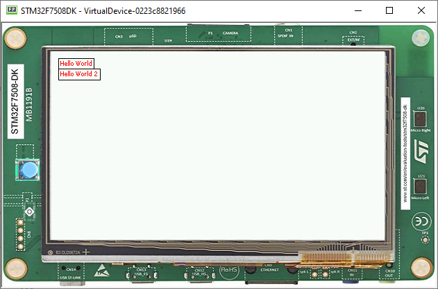
Using margin and padding is pretty simple. Adding margin is as follows:
style.setMargin(new UniformOutline(4));

Setting an oversized margin looks like this:
style.setMargin(new UniformOutline(10));

Adding padding:
style.setPadding(new UniformOutline(2));

Oversizing the padding (the widgets ovelap each other because we use a canvas with fixed positions):
style.setPadding(new UniformOutline(15));

Next step: Images
