MWT Examples
The MWT Examples are code samples that show how to implement various use cases with MWT.
Because the MWT toolkit is designed to be compact and customizable, it allows for many possibilities when developing a GUI. Thus, the examples can be used, with or without modifications, to extend and customize the MWT framework for your specific needs. They also help to learn the best practices for the development of graphic interfaces with MWT.
Source
To get the source code of these examples, clone the following GitHub repository: https://github.com/MicroEJ/ExampleJava-MWT.
The repository contains several Gradle projects (one project for each example) that can be imported in your favorite IDE.
For each project, please refer to its README.md file for more details about the example and its usage.
Provided Examples
Attribute Selectors
|
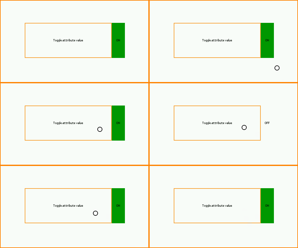
This example shows how to customize the style of widgets using attribute selectors, similar to CSS Attribute Selectors. It provides several types of attribute selectors, any of which can be used in a stylesheet to select widgets based on custom attributes. In this case, the background color of a label switches depending on the value of an attribute of the label. |
Buffered Image Pool
|
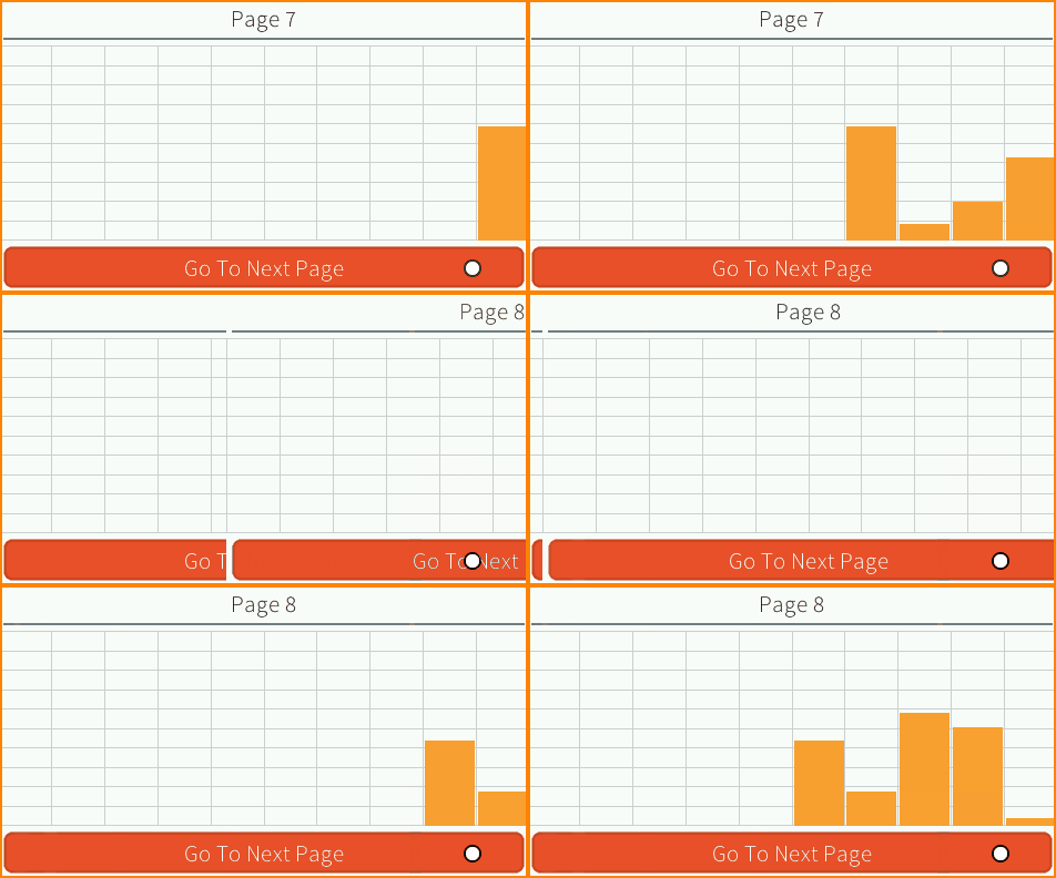
This example shows how to use a pool of BufferedImages to share them across an application. In this example, there is one image in the pool, which is shared between the histogram widget and the transition container. |
Context-Sensitive Container

|
This example shows a smartwatch application that looks different depending on whether the user is wearing the device on the left arm or on the right arm. It demonstrates how a container can adapt to the context by changing how its children are laid out: in this case, depending on the wrist mode, the widgets are displayed on either the left or right side. For demonstration purposes, the example displays a virtual watch to simulate the device flip. |
Drag’n’Drop
|
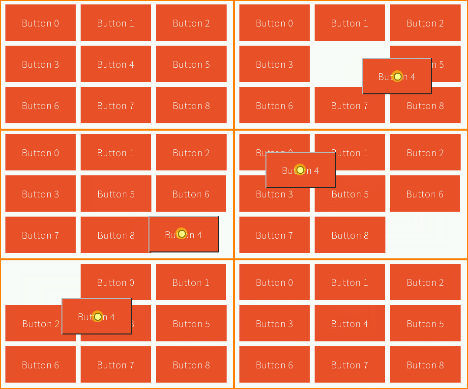
This example shows how to implement drag’n’drop support in a grid. |
Focus
|
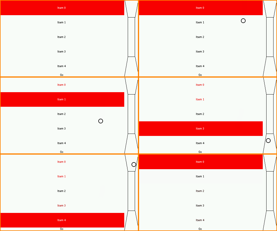
This example shows how to introduce focus management in a project when using peripherals like buttons or a joystick. The virtual joystick (on the right) is used to simulate a hardware joystick. When the joystick directions (up, down, left, right) are pressed, the focus changes on the items in the same way as when using the touch pointer. |
Immutable Stylesheet
|
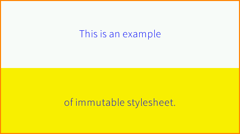
This example shows how to create and use an immutable stylesheet. The immutable stylesheet resolves the style for a widget with the same algorithm as the cascading stylesheet. The difference is that the immutable stylesheet is described in an immutable file instead of Java code. Therefore, the style objects are allocated in flash instead of the Managed Heap. |
Lazy Stylesheet
|
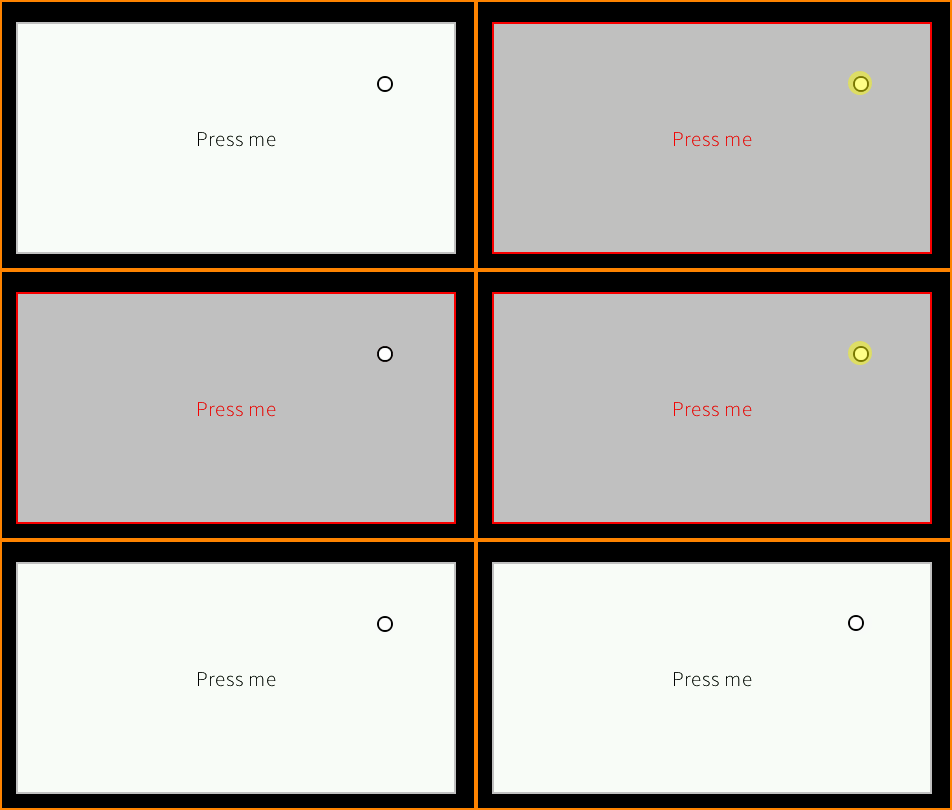
This example shows how to create and use a “lazy” stylesheet. The lazy stylesheet resolves the style for a widget with the same algorithm as the cascading stylesheet. The difference is that the lazy stylesheet associates style factories with selectors (rather than style instances). As a result, the style elements are allocated “on demand” when a rule’s selector applies to a widget. |
Masking Grid
|
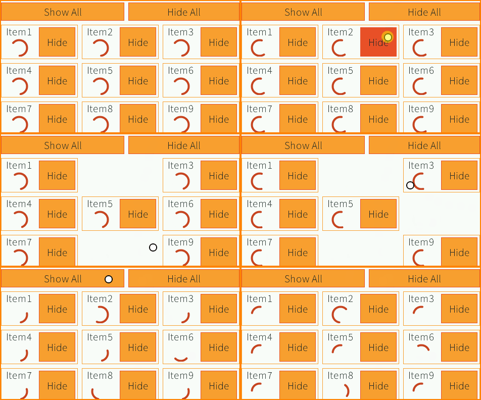
This example shows how to mask a widget temporarily. The grid is a custom container ( |
MVC
|
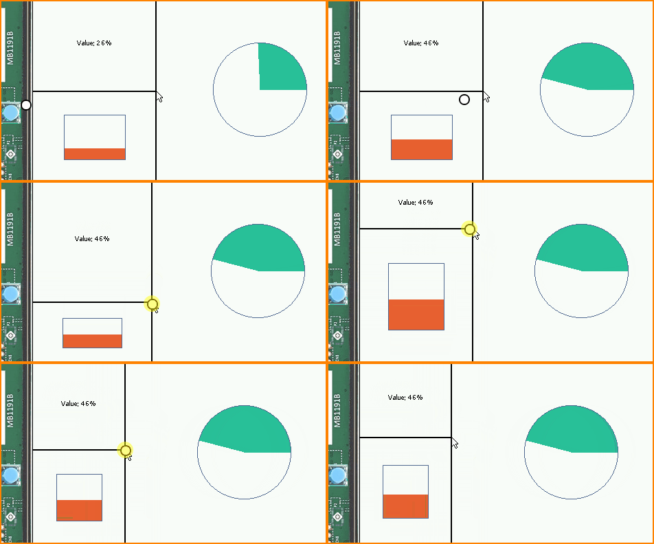
This example shows how to create and use an MVC design pattern (Model, View, Controller). The value of the model can be changed by clicking on the physical button. It is also possible to resize all the widgets at once. |
Popup
|
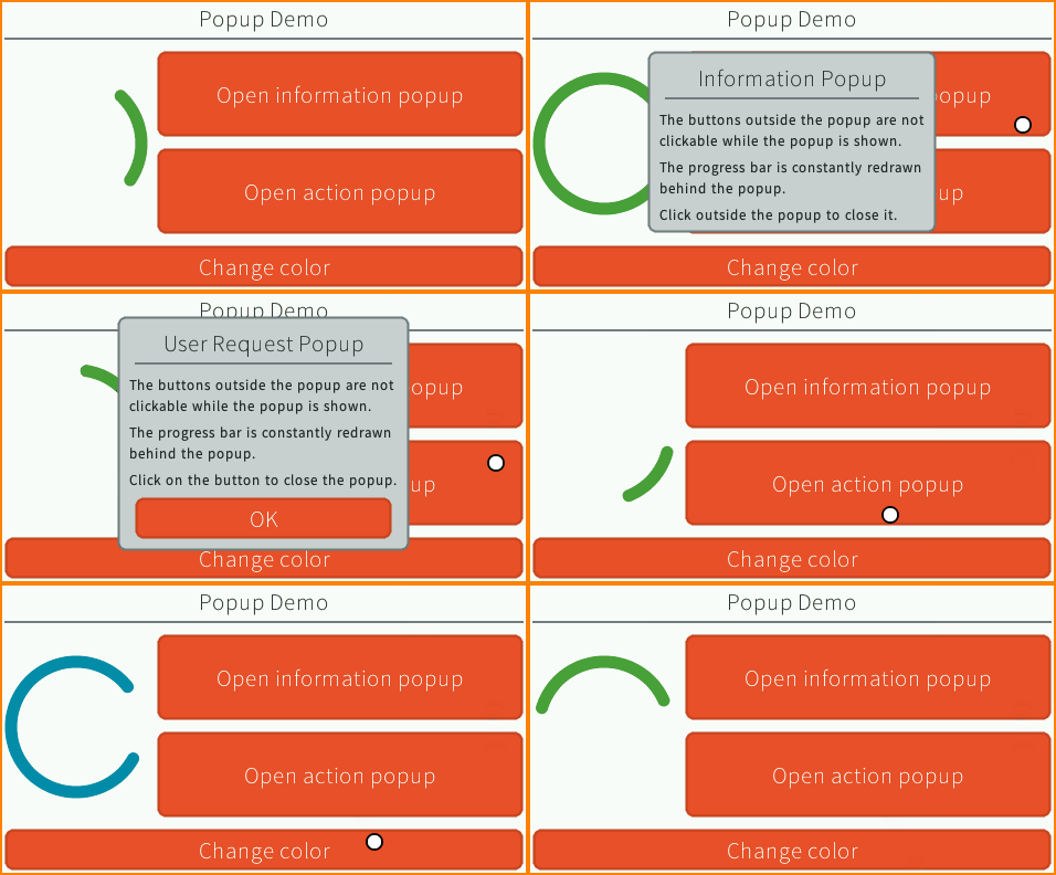
This example shows how to show a popup in an application. Two types of popups are illustrated. The information popup can be dismissed by clicking outside of its bounds. The action popup needs the user to click on a button to close it. |
Remove Widget
|
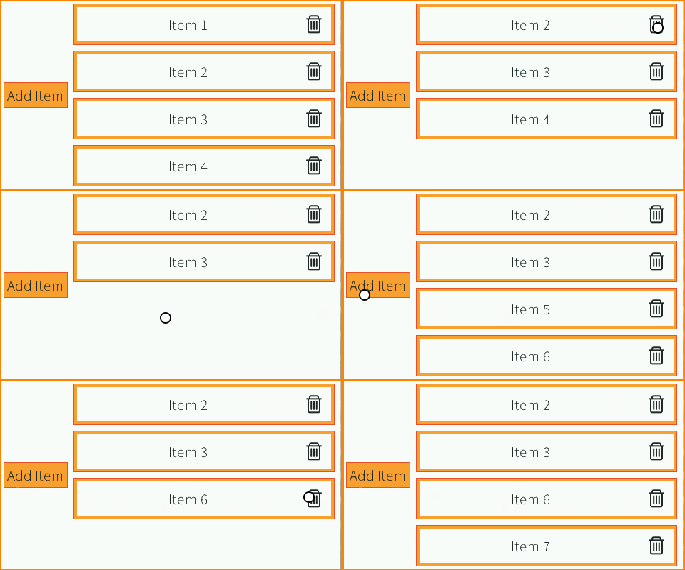
This example shows how to add and remove widgets in a widget hierarchy. The layout adapts automatically to the number of items because |
Slide Container
|
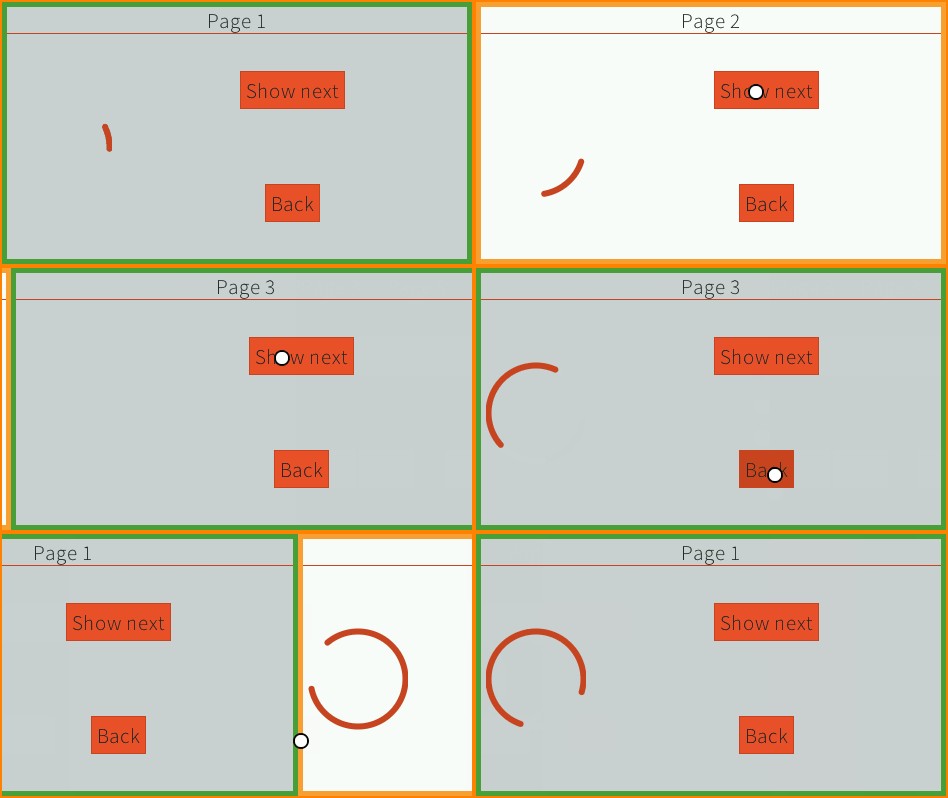
This example shows a slide container. This is a container that shows only its last child. An animation is done when adding/removing a child by translating the widgets from/to the right. |
Stack Container
|
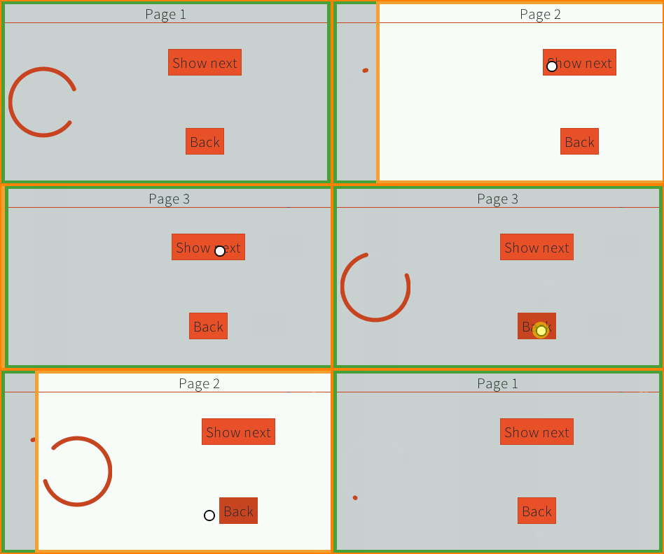
This example shows a stack container. This is a container that stacks its children on top of each other. An animation is done when adding/removing a child by translating the widget from/to the right. |
Stashing Grid
|
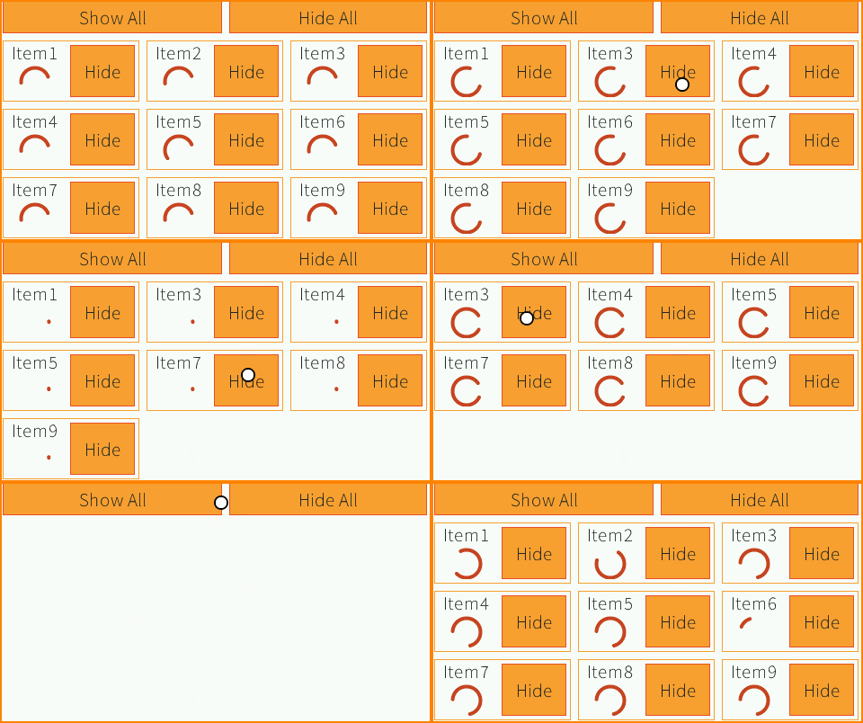
This example shows how to stash a widget temporarily. The grid is a custom container ( |
Theming and Branding
|
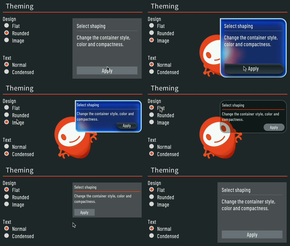
This example shows how to create theming and branding for your project. The application contains only one page. There are two different types of theming shown:
|
Transition
|
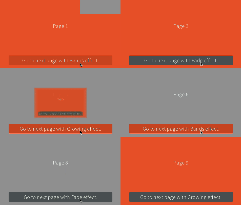
This example shows a container that triggers effects during page transitions. The effect applied to the transition container can be changed dynamically. New effects can be developed easily. |
Virtual Watch
|
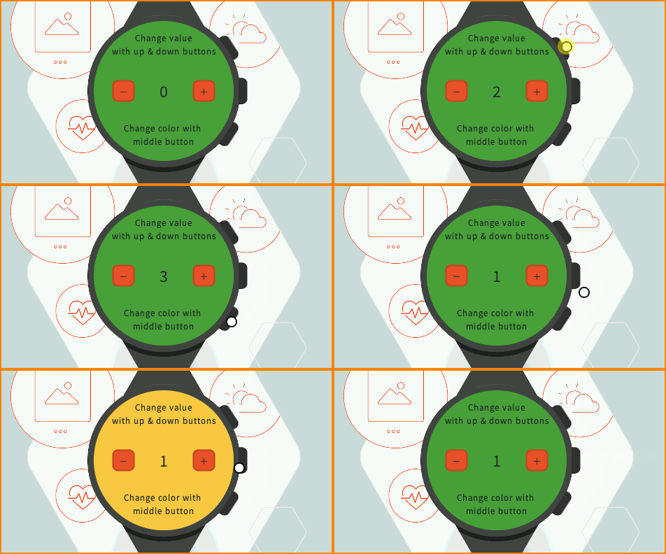
This example shows how to simulate the skin and inputs of a device with a different device (e.g., an evaluation board). This can be a convenient option when the target hardware is not yet available. Here, it simulates a watch with a round screen and 3 buttons. The actual application is shown in a round area of the screen and receives events from the virtual buttons. The virtual buttons send commands when clicked, the same way a target device would have sent events from the native world. The goal is to be able to migrate the application on the target device without modifying the application code. |
