
Concepts
Graphical Elements
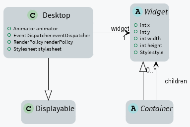
Widget
A widget is an object that is intended to be displayed on a screen. A widget occupies a specific region of the display and holds a state. A user may interact with a widget (using a touch screen or a button for example).
Widgets are arranged on a desktop. A widget can be part of only one desktop hierarchy, and can appear only once on that desktop.
Container
A container follows the composite pattern: it is a widget composed of other widgets. It also defines the layout policy of its children (defining their bounds). The children’s positions are relative to the position of their parent. Containers can be nested to design elaborate user interfaces.
By default, the children are rendered in the order in which they have been added in the container. And thus if the container allows overlapping, the widgets added last will be on top of the widgets added first. A container can also modify how its children are rendered.
Desktop
A desktop is a displayable intended to be shown on a display (cf. MicroUI). At any time, only one desktop can be displayed per display.
A desktop contains a widget (or a container). When the desktop is shown, its widget (and all its hierarchy for a container) is drawn on the display.
Rendering
A new rendering of a widget on the display can be requested by calling its requestRender() method. The rendering is done asynchronously in the MicroUI thread.
When a container is rendered, all its children are also rendered.
A widget can be transparent, meaning that it does not draw every pixel within its bounds. In this case, when this widget is asked to be rendered, its parent is asked to be rendered in the area of the widget (recursively if the parent is also transparent). Usually a widget is transparent when its background (from the style) is transparent.
A widget can also be rendered directly in a specific graphics context by calling its render(GraphicsContext) method. It can be useful to render a widget (and its children) in an image for example.
Render Policy
A render policy is a strategy that MWT uses in order to repaint the entire desktop or to repaint a specific widget.
The most naive render policy would be to render the whole hierarchy of the desktop whenever a widget has changed. However DefaultRenderPolicy is smarter than that: it only repaints the widget, and its ancestors if the widget is transparent. The result is correct only if there is no overlapping widget, in which case OverlapRenderPolicy should be used instead. This policy repaints the widget (or its non-transparent ancestor), then it repaints all the widgets that overlap it.
When using a partial buffer, these render policies can not be used because they render the entire screen in a single pass. Instead, a custom render policy which renders the screen in multiple passes has to be used. Refer to the partial buffer demo for more information on how to implement this render policy and how to use it.
The render policy can be changed by overriding Desktop.createRenderPolicy().
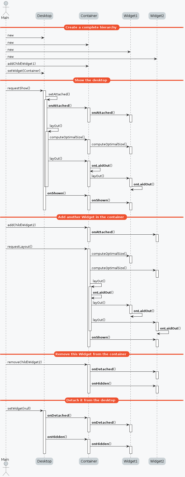
Widget Lifecycle
Desktops and widgets run through different states. Once created, they can be attached, then they can be laid out, and finally they can be shown.
A desktop is attached automatically as soon as it is shown on the display and detached when hidden. It can also be attached manually by calling Desktop.setAttached() or detached by calling Desktop.setDetached(). It is particularly useful to render the desktop (and its widgets) in a buffered image for example.
A widget is considered as attached when it is contained in a desktop that is attached. In the same way, by default, a widget is shown when its desktop is shown. But for optimization purposes, a container can control when its children are shown or hidden. A typical use case is when the widgets are moved outside the display (in a scroll container for instance).
Hooks
When attached, a widget is notified by a call to its onAttached() method. This notification can be useful to allocate some images or other resources for example. These resources can be used to compute the size of the widget and to render it. In other words, after this call, a widget is ready to be laid out.
After being laid out, a widget is notified by a call to its onLaidOut() method. Being laid out means that its bounds inside its parent are set. During this call, the widget can prepare some resources used later by the rendering. For example, it can split a string into several lines based on its width. Another idea could be to allocate a buffered image and draw the background to avoid repainting everything during the rendering.
Beware that a widget can be laid out several times once attached (typically each time a Desktop.requestLayOut() or Widget.requestLayOut() is done).
When a whole hierarchy is ready to be rendered, all the widgets are notified by a call to their onShown() method. This notification is particularly useful to start a periodic refresh or an animation.
A widget can finally be hidden and detached, in which cases its methods onHidden() and onDetached() will be called respectively. In these methods, anything that has been started or allocated during the previous phases must be stopped or freed correctly to avoid memory leaks.
Lay Out
All widgets are laid out at once during the lay out process. This process can be started by Desktop.requestLayOut() or Widget.requestLayOut(). The layout is also automatically done when the desktop is shown (Desktop.onShown()).
This process is composed of two steps. Each step browses the hierarchy of widgets following a depth-first algorithm:
Compute the optimal size for each widget and container (considering the constraints of the lay out).
Set the position and size for each widget.
A widget must implement its Widget.computeContentOptimalSize() method. It is explained in detail in this section: Computing the Optimal Size of the Widget.
A container is responsible for laying out its children. For that it must implement its own Widget.computeContentOptimalSize() method and call the Container.computeChildOptimalSize() method for each of its children. And it must implement its Container.layOutChildren() method and call the Container.layOutChild() method for each of its children. It is explained in detail in these sections: Computing the Optimal Size of the Container and Laying out the Children of the Container.
Rendering Pipeline
The Rendering Pipeline of an MWT application consists of three main phases: Layout, Render, and Flush.
Layout: This phase determines which widgets should be displayed on the screen and the positions of the widgets. It is typically triggered when widgets are added or removed from the widget hierarchy. An application should only modify the widget hierarchy when necessary and avoid doing so during animation to ensure efficiency.
Render: During this phase, each widget executes its rendering code to perform the necessary drawing operations. The widgets must render only what is needed and minimize overlapping with other widgets to ensure optimal performance.
Flush: This phase involves copying the back buffer to the front buffer. The VEE Port performs this operation, and it is the responsibility of the VEE Port developer to optimize this process, for example, by utilizing a GPU.
Event Dispatch
Events generated in the hardware (touch, buttons, etc.) are sent to the event dispatcher of the desktop. It is then responsible of sending the event to one or several widgets of the hierarchy. A widget receives the event through its handleEvent(int) method. This method returns a boolean that indicates whether or not the event has been consumed by the widget.
Widgets are disabled by default and don’t receive the events.
Pointer Event Dispatcher
By default, the desktop proposes an event dispatcher that handles only pointer events.
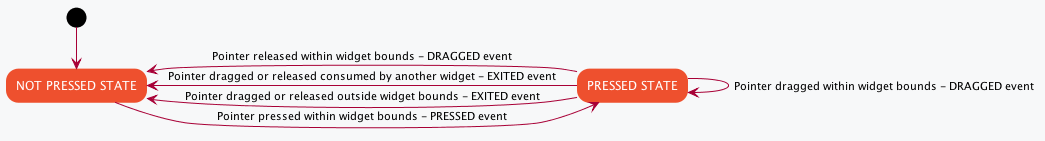
Pointer events are grouped in sessions. A session starts when the pointer is pressed, and ends when the pointer is released or when it exits the pressed widget.
While no widget consumes the events, they are sent to the widget that is under the pointer (see Desktop.getWidgetAt(int, int)), then sent to all its parent hierarchy recursively.
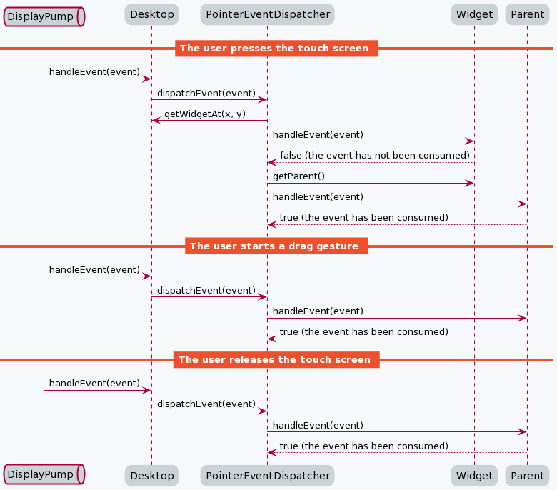
Once a widget has consumed an event, it will be the only one to receive the next events during the session.
Use case examples:
A button-like widget should not consume the press event since the user can drag the pointer after that.
In a simple case, the user may release the pointer outside the bounds of the button, thus the button will not be clicked.
Or the button may be included in a container that capture the drag events (and/or the release ones) to perform a scroll or a drag-and-drop for instance.
In the same way, a directed scroll (horizontal or vertical) should only start to consume pointer events once a swipe in the right direction is detected. This way, 2 scrolls with opposite directions may be nested, each one handling one direction.
By default, the reactive area of a widget is the boundaries of its content, plus its padding, plus its border (does not include the margin).
A widget can redefine its reactive area by subclassing the contains(int x, int y) method. It is useful when a widget does not fill fully its bounds.
Style
A style describes how widgets must be rendered on screen. The attributes of the style are strongly inspired from CSS.
Dimension
The dimension is used to constrain the size of the widget.
MWT provides multiple implementations of dimensions:
NoDimension does not constrain the dimension of the widget, so the widget will take all the space granted by its parent container.
OptimalDimension constrains the dimension of the widget to its optimal size, which is given by the computeContentOptimalSize() method of the widget.
FixedDimension constrains the dimension of the widget to a fixed absolute size.
RelativeDimension constrains the dimension of the widget to a percentage of the size of its parent container.
Alignment
The horizontal and vertical alignments are used to position the content of the widget within its bounds.
The alignment is used by the framework to position the widget within its available space if the size of the widget has been constrained with a Dimension.
The alignment can also be used in the renderContent() method in order to position the drawings of the widget (such as a text or an image) within its content bounds.
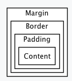
Outlines
The margin, border and padding are the 3 outlines which wrap the content of the widget. The widget is wrapped in the following sequence: first the padding, then the border, and finally the margin.
MWT provides multiple implementations of invisible outlines which are usually used for margin and padding:
NoOutline does not wrap the widget in an outline.
UniformOutline wraps the widget in an outline which thickness is equal on all sides.
FlexibleOutline wraps the widget in an outline which thickness can be configured for each side.
MWT also provides multiple implementations of visible outlines which are usually used for border:
RectangularBorder draws a plain rectangle around the widget.
RoundedBorder draws a plain rounded rectangle around the widget.
Background
The background is used to render the background of the widget. The background covers the border, the padding and the content of the widget, but not its margin.
MWT provides multiple implementations of backgrounds:
NoBackground leaves a transparent background behind the widget.
RectangularBackground draws a plain rectangle behind the widget.
RoundedBackground draws a plain rounded rectangle behind the widget.
ImageBackground draws an image behinds the widget.
Color
The color is not used by the framework itself, but it may be used in the renderContent() to select the color of the drawings.
Font
The font is not used by framework itself, but it may be used in the renderContent() to select the font to use when drawing strings.
Extra Fields
Extra fields are not used by framework itself, but they may be used in the renderContent() to customize the behavior and the appearance of the widget.
See chapter How to Define an Extra Style Field for more information on extra fields.
Stylesheet
A stylesheet allows to customize the appearance of all the widgets of a desktop without changing the code of the widget subclasses.
MWT provides multiple implementations of stylesheets:
VoidStylesheet assigns the same default style for every widget.
CascadingStylesheet assigns styles to widgets using selectors, similarly to CSS.
For example, the following code customizes the style of every Label widget of the desktop:
CascadingStylesheet stylesheet = new CascadingStylesheet();

EditableStyle labelStyle = stylesheet.getSelectorStyle(new TypeSelector(Label.class));
labelStyle.setColor(Colors.RED);
labelStyle.setBackground(new RectangularBackground(Colors.WHITE));

desktop.setStylesheet(stylesheet);
Widget’s Style
At any time, a widget has a style that can be retrieved using Widget.getStyle() method.
When created, the widget’s style contains the default value for each field. These default values are defined in the DefaultStyle class.
Once it is attached to a desktop, the widget’s style is computed from the stylesheet set in the desktop. This is done using the Stylesheet.getStyle() method. The style can then be used when laying out and rendering the widget.
At any time, the style of the widget can be recomputed by calling Widget.updateStyle(). For example when its state changes:
When a button is pressed or released.
When a checkbox is checked or unchecked.
etc.
Animations
MWT provides a utility class in order to animate widgets: Animator. When a widget is being animated by an animator, the widget is notified each time that the display is flushed. The widget can use this interrupt in order to update its state and request a new rendering.
See chapter How to Animate a Widget for more information on animating a widget.
Partial Buffer Considerations
Rendering a widget in partial buffer mode may require multiple cycles if the buffer is not big enough to hold all the pixels to update in a single shot. This means that rendering is slower in partial buffer mode, and this may cause performance being significantly affected during animations.
Besides, the whole screen is flushed in multiple times instead of a single one, which means that the user may see the display at a time where every part of the display has not been flushed yet.
Due to these limitations, it is not recommended to repaint big parts of the screen at the same time. For example, a transition on a small part of the screen will look better than a transition affecting the whole screen. A transition will look perfect if the partial buffer can hold all the lines to repaint. Since the buffer holds a group of lines, a horizontal transition may not look the same as a vertical transition.